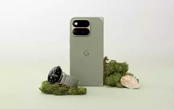
Google has recently initiated a quiet overhaul of several Pixel application icons, moving them toward a more unified and expressive design language, following the introduction of its Pixel 11 series. While the alterations are subtle, they contribute to a more polished and integrated user interface on Pixel devices.
Google's Subtle Icon Makeover for Pixel Applications
In the wake of the Pixel 11 series' debut, Google has begun to roll out refreshed icons for several of its core Pixel applications. These updates are designed to align the app aesthetics more closely with Google's Material 3 Expressive design principles, aiming for a cleaner and more consistent visual experience across the Android platform.
Among the first to receive this aesthetic treatment are the Weather and Recorder applications. The Weather app's icon, while retaining its familiar sun-and-cloud motif, now features a more vibrant color palette, including a brighter sun and a gradient cloud set against a clean white background. This results in a crisper, more contemporary appearance. The Recorder app, in contrast, underwent a more distinct transformation, shedding its former background for a minimalist red waveform, enhancing its visual clarity.
Reports indicate that further updates are anticipated for the Pixel Camera, Calculator, and Clock applications. The Pixel Camera is expected to maintain its camera-inspired silhouette but will adopt a refined shape and a fresh blue gradient color scheme. The Calculator app is poised for simplification, replacing its background with a combination of light and dark green circles encapsulating mathematical symbols. Meanwhile, the Clock app will embrace the playful geometric forms characteristic of Material 3 Expressive, departing from its previous straightforward blue background and white outline.
These meticulous redesigns, though not immediately striking, play a crucial role in harmonizing the visual elements within the Pixel ecosystem. By ensuring that applications from different generations of Android exhibit a consistent look and feel, Google is enhancing the overall user experience, making the Pixel home screen appear more cohesive and thoughtfully curated.
These discreet yet significant design enhancements underscore Google's dedication to refining the user experience. By subtly updating the visual language of its applications, the company ensures that even the smallest details contribute to a more harmonious and modern interface. This iterative approach to design helps to maintain a fresh and cohesive identity for the Pixel brand, reinforcing the idea that thoughtful design is an ongoing process of refinement.